一款基于css3的简单的鼠标悬停按钮
阅读:1875
时间:2018-02-01 03:25
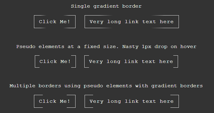
今天给大家分享一款基于css3的简单的鼠标悬停按钮。这款悬停按钮鼠标经过前边框是间断的。当鼠标经过的时候边框间隔消失。效果图如下:
实现的代码。
html代码:
  <div class="container">
        <p>
            Single gradient border</p>
        <a href="#" class="btn">Click Me!</a> <a href="#" class="btn">Very long link text here</a>
    </div>
    <div class="container">
        <p>
            Pseudo elements at a fixed size. Nasty 1px drop on hover</p>
        <a href="#" class="btn2">Click Me!</a> <a href="#" class="btn2">Very long link text
            here</a>
    </div>
    <div class="container">
        <p>
            Multiple borders using pseudo elements with gradient borders</p>
        <a href="#" class="btn3">Click Me!</a> <a href="#" class="btn3">Very long link text
            here</a>
    </div>
    <h1>
        <a href="#" class="btn3">A Huge Link</a></h1>
css3代码:
        body
        {
            font-family: "Courier New" , "Inconsolata" , monospace;
            font-size: 18px;
            line-height: 26px;
            background: #333;
            color: #fff;
        }
        h1
        {
            font-weight: 100;
            font-size: 80px;
            line-height: 90px;
            text-align: center;
        }
        .container
        {
            width: 800px;
            margin: 50px auto;
            text-align: center;
        }
        .btnCommon
        {
            display: inline-block;
            text-decoration: none;
            color: #fff;
            padding: 8px 16px;
            margin: 0 10px;
            border: 1px solid #fff;
            letter-spacing: 1px;
        }
        .btnCommon:hover
        {
            text-shadow: 1px 1px 1px rgba(0, 0, 0, 0.8);
        }
        .btn
        {
            display: inline-block;
            text-decoration: none;
            color: #fff;
            padding: 8px 16px;
            margin: 0 10px;
            border: 1px solid #fff;
            letter-spacing: 1px;
            border-image: linear-gradient(to right, #ffffff 15%, rgba(0, 0, 0, 0) 30%, rgba(0, 0, 0, 0) 70%, #ffffff 85%) 1;
            transition: all .2s;
        }
        .btn:hover
        {
            text-shadow: 1px 1px 1px rgba(0, 0, 0, 0.8);
        }
        .btn:hover
        {
            transition: all .2s;
            background: rgba(255, 255, 255, 0.2);
            border: 1px solid #fff;
        }
        .btn2
        {
            display: inline-block;
            text-decoration: none;
            color: #fff;
            padding: 8px 16px;
            margin: 0 10px;
            border: 1px solid #fff;
            letter-spacing: 1px;
            border: none;
            height: 40px;
            line-height: 40px;
            position: relative;
            padding: 0;
            margin: 0 25px;
        }
        .btn2:hover
        {
            text-shadow: 1px 1px 1px rgba(0, 0, 0, 0.8);
        }
        .btn2:before, .btn2:after
        {
            width: 15px;
            border: 1px solid #fff;
            position: absolute;
            content: "";
            height: 40px;
            top: -1px;
        }
        .btn2:before
        {
            left: -16px;
            border-right: none;
        }
        .btn2:after
        {
            right: -16px;
            border-left: none;
        }
        .btn2:hover, .btn2:hover:before, .btn2:hover:after
        {
            transition: all .2s;
            background: rgba(255, 255, 255, 0.2);
            border-color: pink;
        }
        .btn2:hover
        {
            border: 1px solid pink;
            border-width: 1px 0 1px 0;
        }
        .btn3
        {
            display: inline-block;
            text-decoration: none;
            color: #fff;
            padding: 8px 16px;
            margin: 0 10px;
            border: 1px solid #fff;
            letter-spacing: 1px;
            position: relative;
            border: 1px solid rgba(0, 0, 0, 0);
            transition: all .2s;
        }
        .btn3:hover
        {
            text-shadow: 1px 1px 1px rgba(0, 0, 0, 0.8);
        }
        .btn3:before, .btn3:after
        {
            display: inline-block;
            width: 100%;
            height: 100%;
            content: "";
            position: absolute;
            left: -1px;
            top: -1px;
            border-width: 1px;
            transition: all .2s;
        }
        .btn3:before
        {
            border-image: linear-gradient(to right, #ffffff 30px, rgba(0, 0, 0, 0) 16px) 1;
        }
        .btn3:after
        {
            border-image: linear-gradient(to left, #ffffff 30px, rgba(0, 0, 0, 0) 16px) 1;
        }
        .btn3:hover
        {
            transition: all .2s;
            background: rgba(255, 255, 255, 0.2);
        }
        .btn3:hover:before, .btn3:hover:after
        {
            border: 1px solid rgba(0, 0, 0, 0);
            transition: all .2s;
        }
注:本文爱编程原创文章,转载请注明原文地址:http://www.w2bc.com/Article/9826


版权所有 爱编程 © Copyright 2012. All Rights Reserved.
闽ICP备12017094号-3
闽ICP备12017094号-3