一款纯css3实现的超炫动画背画特效
阅读:2143
时间:2018-02-01 03:25
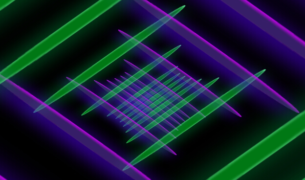
之前为大家介绍了很多款由纯css3实现的特效。今天要再给大家带来一款纯css3实现的超炫动画背画特效。代码非常简单,没有引用任何其它js代码。css代码也不多。效果非常炫。一起看下效果图:
实现的代码。
html代码:
 <div class='fake-gif'>
        <span class='stripe'></span><span class='stripe'></span><span class='stripe'></span>
        <span class='stripe'></span><span class='stripe'></span><span class='stripe'></span>
        <span class='stripe'></span><span class='stripe'></span><span class='stripe'></span>
        <span class='stripe'></span><span class='stripe'></span><span class='stripe'></span>
        <span class='stripe'></span><span class='stripe'></span><span class='stripe'></span>
        <span class='stripe'></span><span class='stripe'></span><span class='stripe'></span>
        <span class='stripe'></span><span class='stripe'></span><span class='stripe'></span>
        <span class='stripe'></span><span class='stripe'></span><span class='stripe'></span>
        <span class='stripe'></span><span class='stripe'></span>
    </div>
css3代码:
        body{
	background: #000;
	-webkit-perspective:35px;
   -moz-perspective:35px;
    -ms-perspective:35px;
     -o-perspective:35px;
        perspective:35px;
	-webkit-transform-style:preserve-3d;
	-moz-transform-style:preserve-3d;
	-ms-transform-style:preserve-3d;
	-o-transform-style:preserve-3d;
	transform-style:preserve-3d;
	-webkit-transform: rotateX(45deg) rotateY(0deg) rotateZ(45deg);
	-moz-transform:rotateX(45deg) rotateY(0deg) rotateZ(45deg);
	-ms-transform:rotateX(45deg) rotateY(0deg) rotateZ(45deg);
	-o-transform:rotateX(45deg) rotateY(0deg) rotateZ(45deg);
	transform:rotateX(45deg) rotateY(0deg) rotateZ(45deg);
	}


	.fake-gif {
  position: relative;
  margin: 10rem auto 0 auto;
  width: 20rem;
  height: 20rem;


}
.fake-gif .stripe {
  position: absolute;
  border-radius: 50%;
  -webkit-box-shadow: 2px 2px 0 rgba(0, 0, 0, 0.3);
  box-shadow: 2px 2px 0 rgba(0, 0, 0, 0.3);
  -webkit-transform: translate3d(0px, 0px, 0px);
  transform: translate3d(0px, 0px, 0px);
}
.fake-gif .stripe:nth-child(odd) {
  left: 0;
  width: 100%;
  height: 5%;
background-color: rgba(109, 60, 209, 0.5);
box-shadow: 0px 6px 40px #5800FF, inset 0px 2px 5px #DF00FF;

}
.fake-gif .stripe:nth-child(even) {
  top: 0;
  width: 5%;
  height: 100%;
 background-color: rgba(0, 240, 40, 0.5);
box-shadow: 0px 6px 40px #007D35, inset 0px 2px 5px #7CFFB5;
}
.fake-gif .stripe:nth-child(4n+1) {
  z-index: 3;
}
.fake-gif .stripe:nth-child(4n+2) {
  z-index: 4;
}
.fake-gif .stripe:nth-child(4n+3) {
  z-index: 1;
}
.fake-gif .stripe:nth-child(4n) {
  z-index: 2;
}
.fake-gif .stripe:nth-child(2) {
  left: 4.7%;
  -webkit-animation: move-y 2.7s 0.2s infinite;
  animation: move-y 2.7s 0.2s infinite;
}
.fake-gif .stripe:nth-child(4) {
  left: 11.9%;
  -webkit-animation: move-y 2.7s 0.4s infinite;
  animation: move-y 2.7s 0.4s infinite;
}
.fake-gif .stripe:nth-child(6) {
  left: 19.1%;
  -webkit-animation: move-y 2.7s 0.6s infinite;
  animation: move-y 2.7s 0.6s infinite;
}
.fake-gif .stripe:nth-child(8) {
  left: 26.3%;
  -webkit-animation: move-y 2.7s 0.8s infinite;
  animation: move-y 2.7s 0.8s infinite;
}
.fake-gif .stripe:nth-child(10) {
  left: 33.5%;
  -webkit-animation: move-y 2.7s 1s infinite;
  animation: move-y 2.7s 1s infinite;
}
.fake-gif .stripe:nth-child(12) {
  left: 40.7%;
  -webkit-animation: move-y 2.7s 1.2s infinite;
  animation: move-y 2.7s 1.2s infinite;
}
.fake-gif .stripe:nth-child(14) {
  left: 47.9%;
  -webkit-animation: move-y 2.7s 1.4s infinite;
  animation: move-y 2.7s 1.4s infinite;
}
.fake-gif .stripe:nth-child(16) {
  left: 55.1%;
  -webkit-animation: move-y 2.7s 1.6s infinite;
  animation: move-y 2.7s 1.6s infinite;
}
.fake-gif .stripe:nth-child(18) {
  left: 62.3%;
  -webkit-animation: move-y 2.7s 1.8s infinite;
  animation: move-y 2.7s 1.8s infinite;
}
.fake-gif .stripe:nth-child(20) {
  left: 69.5%;
  -webkit-animation: move-y 2.7s 2s infinite;
  animation: move-y 2.7s 2s infinite;
}
.fake-gif .stripe:nth-child(22) {
  left: 76.7%;
  -webkit-animation: move-y 2.7s 2.2s infinite;
  animation: move-y 2.7s 2.2s infinite;
}
.fake-gif .stripe:nth-child(24) {
  left: 83.9%;
  -webkit-animation: move-y 2.7s 2.4s infinite;
  animation: move-y 2.7s 2.4s infinite;
}
.fake-gif .stripe:nth-child(26) {
  left: 91.1%;
  -webkit-animation: move-y 2.7s 2.6s infinite;
  animation: move-y 2.7s 2.6s infinite;
}
.fake-gif .stripe:nth-child(1) {
  top: 3.6%;
  -webkit-animation: move-x 2.7s 0.1s infinite;
  animation: move-x 2.7s 0.1s infinite;
}
.fake-gif .stripe:nth-child(3) {
  top: 10.8%;
  -webkit-animation: move-x 2.7s 0.3s infinite;
  animation: move-x 2.7s 0.3s infinite;
}
.fake-gif .stripe:nth-child(5) {
  top: 18%;
  -webkit-animation: move-x 2.7s 0.5s infinite;
  animation: move-x 2.7s 0.5s infinite;
}
.fake-gif .stripe:nth-child(7) {
  top: 25.2%;
  -webkit-animation: move-x 2.7s 0.7s infinite;
  animation: move-x 2.7s 0.7s infinite;
}
.fake-gif .stripe:nth-child(9) {
  top: 32.4%;
  -webkit-animation: move-x 2.7s 0.9s infinite;
  animation: move-x 2.7s 0.9s infinite;
}
.fake-gif .stripe:nth-child(11) {
  top: 39.6%;
  -webkit-animation: move-x 2.7s 1.1s infinite;
  animation: move-x 2.7s 1.1s infinite;
}
.fake-gif .stripe:nth-child(13) {
  top: 46.8%;
  -webkit-animation: move-x 2.7s 1.3s infinite;
  animation: move-x 2.7s 1.3s infinite;
}
.fake-gif .stripe:nth-child(15) {
  top: 54%;
  -webkit-animation: move-x 2.7s 1.5s infinite;
  animation: move-x 2.7s 1.5s infinite;
}
.fake-gif .stripe:nth-child(17) {
  top: 61.2%;
  -webkit-animation: move-x 2.7s 1.7s infinite;
  animation: move-x 2.7s 1.7s infinite;
}
.fake-gif .stripe:nth-child(19) {
  top: 68.4%;
  -webkit-animation: move-x 2.7s 1.9s infinite;
  animation: move-x 2.7s 1.9s infinite;
}
.fake-gif .stripe:nth-child(21) {
  top: 75.6%;
  -webkit-animation: move-x 2.7s 2.1s infinite;
  animation: move-x 2.7s 2.1s infinite;
}
.fake-gif .stripe:nth-child(23) {
  top: 82.8%;
  -webkit-animation: move-x 2.7s 2.3s infinite;
  animation: move-x 2.7s 2.3s infinite;
}
.fake-gif .stripe:nth-child(25) {
  top: 90%;
  -webkit-animation: move-x 2.7s 2.5s infinite;
  animation: move-x 2.7s 2.5s infinite;
}

@-webkit-keyframes move-y {
  0%, 100% {
    -webkit-transform: translateZ(-25px);
    transform: translateZ(-25px);
  }

  50% {
    -webkit-transform: translateZ(25px);
    transform: translateZ(25px);
  }
}

@-webkit-keyframes move {
  0%, 100% {
    -webkit-transform: rotateX(-25deg) rotateY(-25deg);
    transform: rotateX(-25deg) rotateY(-25deg);
  }

  50% {
    -webkit-transform: rotateX(25px) rotateY(25deg);
    transform: rotateX(25px) rotateY(25deg);
  }
}

@keyframes move-y {
  0%, 100% {
    -webkit-transform: translateY(-25%);
    transform: translateY(-25%);
  }

  50% {
    -webkit-transform: translateY(25%);
    transform: translateY(25%);
  }
}
@-webkit-keyframes move-x {
  0%, 100% {
    -webkit-transform: translateZ(-25px);
    transform: translateZ(-25px);
  }

  50% {
    -webkit-transform: translateZ(25px);
    transform: translateZ(25px);
  }
}
@keyframes move-x {
  0%, 100% {
    -webkit-transform: translateX(-25%);
    transform: translateX(-25%);
  }

  50% {
    -webkit-transform: translateX(25%);
    transform: translateX(25%);
  }
}
注:本文爱编程原创文章,转载请注明原文地址:http://www.w2bc.com/Article/7428


版权所有 爱编程 © Copyright 2012. All Rights Reserved.
闽ICP备12017094号-3
闽ICP备12017094号-3