一款基于jquery漂亮的按钮
阅读:2101
时间:2018-02-01 03:25
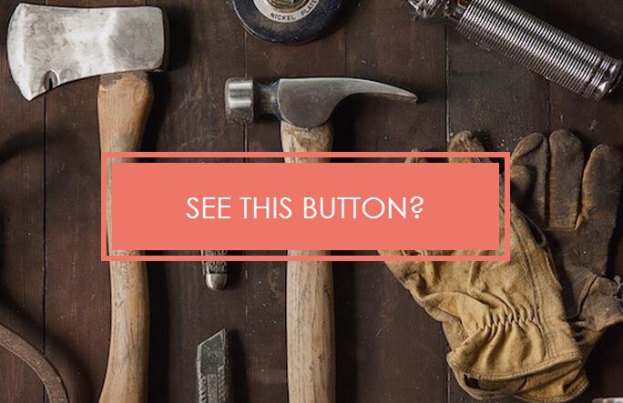
之前为大家分享了好多css3实现的按钮。今天给大家分享一款基于jquery漂亮的按钮。这款按钮背景下用了一张图片。当鼠标经过的时候背景用半透明div遮住。一起看下效果图:
实现的代码。
html代码:
 <a class="btn" data-js="btn"><span class="btn-inr"><span class="txt-a">See This Button?</span>
        <span class="txt-b">Now You do.</span> </span></a>
    <script src='jquery.js'></script>
    <script src='StackBlur.js'></script>
    <script>
        $('[data-js="btn"]').hover(function (e) {
            $(this).toggleClass('active');
            if ($(this).hasClass('active')) {
                $('body').addClass('blur');
            } else {
                $('body').removeClass('blur');
            }
            e.preventDefault();
        }); //@ sourceURL=pen.js
    </script>
css代码:
        .btn
        {
            position: relative;
            top: 50%;
            -webkit-transform: translateY(-50%);
            -ms-transform: translateY(-50%);
            transform: translateY(-50%);
        }

        *, *::before, *::after
        {
            -moz-box-sizing: border-box;
            box-sizing: border-box;
        }

        html, body
        {
            width: 100%;
            height: 100%;
        }

        body
        {
            position: relative;
            font-family: "Lato" , "Avant Garde" , Avantgarde, "Century Gothic" , CenturyGothic, "AppleGothic" , sans-serif;
            font-weight: 300;
            text-align: center;
            overflow: hidden;
            background: url(1.jpg) no-repeat center center;
            background-size: cover;
        }
        body::after
        {
            position: absolute;
            top: 0;
            left: 0;
            display: block;
            width: 100%;
            height: 100%;
            background: -webkit-linear-gradient(315deg, #2980b9 0%, #9B59B6 100%);
            background: linear-gradient(135deg, #2980b9 0%, #9B59B6 100%);
            background-size: 100% auto;
            content: "";
            opacity: 0;
            -webkit-transition: all .65s ease-in-out;
            transition: all .65s ease-in-out;
        }

        .blur::after
        {
            opacity: .85;
        }

        .btn
        {
            position: relative;
            display: inline-block;
            border: 6px solid #ed7669;
            -webkit-transition: all .1s ease-in-out;
            transition: all .1s ease-in-out;
            z-index: 99;
        }
        .btn.active
        {
            box-shadow: 2px 2px 4px rgba(0, 0, 0, 0.25);
        }
        .btn:focus, .btn:hover
        {
            border: 12px solid #e74c3c;
        }

        .btn > span
        {
            min-width: 425px;
            cursor: pointer;
        }

        .btn-inr
        {
            display: inline-block;
            color: white;
            font-weight: 100;
            font-size: 2em;
            line-height: 1;
            text-transform: uppercase;
            background: #ed7669;
            padding: 1em 2em;
            margin: 6px;
            -webkit-transition: all .1s ease-in-out;
            transition: all .1s ease-in-out;
        }
        .btn-inr:focus, .btn-inr:hover
        {
            background: #e74c3c;
            padding: 1em 2em;
            margin: 0;
        }

        .txt-a
        {
            display: inline;
        }

        .txt-b
        {
            display: none;
        }

        .btn:focus .btn-inr, .btn:hover .btn-inr
        {
            background: #e74c3c;
            padding: 1em 2em;
            margin: 0;
        }

        .btn:focus .txt-a, .btn:hover .txt-a
        {
            display: none;
        }

        .btn:focus .txt-b, .btn:hover .txt-b
        {
            display: inline;
        }
注:本文爱编程原创文章,转载请注明原文地址:http://www.w2bc.com/Article/8990


版权所有 爱编程 © Copyright 2012. All Rights Reserved.
闽ICP备12017094号-3
闽ICP备12017094号-3