一款纯css3实现的鼠标经过图片显示描述特效(二)
阅读:3297
时间:2018-02-01 03:25
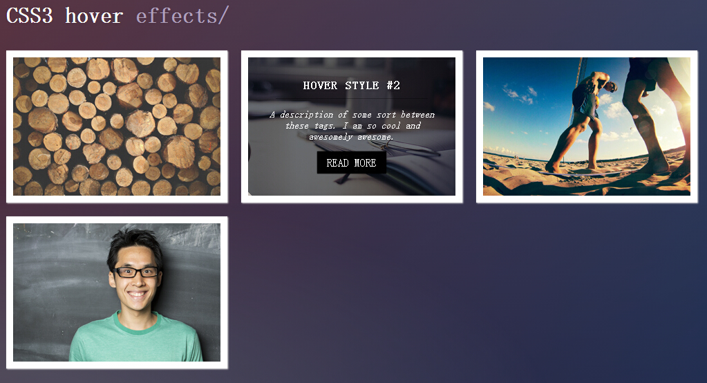
之前为大家介绍了一款纯css3鼠标经过图片显示描述特效,今天要给大家带来一款纯css3实现的鼠标经过图片显示描述特效。在此特效中有两种切换特效,效果还是相当不错。效果图如下:
实现的代码。
html代码:
<h1 style='font-family: Raleway'>
CSS3 hover<span id="hover"> effects/</span></h1>
<div id="all">
<div class="view view-first">
<img src="http://jacobstone.co.uk/Livetesting/logs.jpg" />
<div class="mask">
<h2>
woodsman</h2>
<p>
Logs are nice, I own a few myself. I have even been known to chop the shit with
an axe from time to time. More words.</p>
<a href="#" class="info">Read More</a>
</div>
</div>
<div class="view view-second">
<img src="http://jacobstone.co.uk/Livetesting/book.jpg" />
<div class="mask">
</div>
<div class="content">
<h2>
Hover Style #2</h2>
<p>
A description of some sort between these tags. I am so cool and awesomely awesome.</p>
<a href="#" class="info">Read More</a>
</div>
</div>
<div class="view view-tenth">
<img src="http://jacobstone.co.uk/Livetesting/beach.jpg" />
<div class="mask">
<h2>
The Only Living Boy in New York</h2>
<p>
Words and such, a whole lot more of muh flippin' words.</p>
<a href="#" class="info">Read More</a>
</div>
</div>
<div class="view view-second">
<img src="http://jacobstone.co.uk/Livetesting/guy.jpg" />
<div class="mask">
</div>
<div class="content">
<h2 id="testimonials">
Testimonials</h2>
<p>
“A description of some sort between these tags. I am so cool ye and awesomely
awesome. He was cool.”</p>
<a href="#" class="info">Read More</a>
</div>
</div>
</div>
css代码:
html {
  min-height: 100%;
}

body {
 background: radial-gradient(ellipse at bottom left, rgba(104,128,138,0.4) 10%, rgba(138,114,76,0) 40%), linear-gradient(to bottom, rgba(57,173,219,.25), rgba(42,60,87,0.4)), linear-gradient(135deg, #670d10, #092756);
}

h1 {
  color: white;
  padding-left: 10px;
}

#hover {
  color: rgba(188, 175, 204, 0.9);
}

h2#testimonials {
  color: rgb(94, 244, 177);
}

div#all {
  width: 100%;
  height: 100%;
}

/* generic css */
.view {
    margin: 10px;
    float: left;
    border: 10px solid #fff;
    overflow: hidden;
    position: relative;
    text-align: center;
    box-shadow: 1px 1px 2px #e6e6e6;
    cursor: default;
    background: #fff url(../images/bgimg.jpg) no-repeat center center
}
.view .mask, .view .content {
    width: 300px;
    height: 200px;
    position: absolute;
    overflow: hidden;
    top: 0;
    left: 0
}
.view img {
    display: block;
    position: relative
}
.view h2 {
    text-transform: uppercase;
    color: #fff;
    text-align: center;
    position: relative;
    font-size: 17px;
    font-family: Raleway, serif;
    padding: 10px;
    background: rgba(0, 0, 0, 0.8);
    margin: 20px 0 0 0
}
.view p {
    font-family: Merriweather, serif;
    font-style: italic;
    font-size: 14px;
    position: relative;
    color: #fff;
    padding: 0px 20px 0px;
    text-align: center
}
.view a.info {
    display: inline-block;
    text-decoration: none;
    padding: 7px 14px;
    background: #000;
    color: #fff;
    font-family: Raleway, serif;
    text-transform: uppercase;
    box-shadow: 0 0 1px #000
}
.view a.info:hover {
    box-shadow: 0 0 5px #000
}

/*1*/

.view-first img { /*1*/
    transition: all 0.2s linear;
    width: 300px;
    height: 200px;
}
.view-first .mask {
    opacity: 0;
    background-color: rgba(155, 91, 52, 0.7);
    transition: all 0.4s ease-in-out;

}
.view-first h2 {
    transform: translateY(-100px);
    opacity: 0;
    font-family: Raleway, serif;
    transition: all 0.2s ease-in-out;
}
.view-first p {
    transform: translateY(100px);
    opacity: 0;
    transition: all 0.2s linear;
}
.view-first a.info{
    opacity: 0;
    transition: all 0.2s ease-in-out;
}

/* */

.view-first:hover img {
    transform: scale(1.1);
}
.view-first:hover .mask {
    opacity: 1;
}
.view-first:hover h2,
.view-first:hover p,
.view-first:hover a.info {
    opacity: 1;
    transform: translateY(0px);
}
.view-first:hover p {
    transition-delay: 0.1s;
}
.view-first:hover a.info {
    transition-delay: 0.2s;
}

/*2*/

.view-second img {
    transition: all 0.2s ease-in;
    -webkit-transition: all 0.2s ease-in;
}
.view-second .mask {
    background-color: rgba(12, 19, 27, 0.6);
    width: 300px;
    padding: 105px;
    height: 200px;
    opacity: 0;
    transform: translate(265px, 145px) rotate(45deg);
    -webkit-transform: translate(265px, 145px) rotate(45deg);
    transition: all 0.2s ease-in-out;
    -webkit-transition: all 0.2s ease-in-out;
}
.view-second h2 {
    border-bottom: 1px solid rgba(0, 0, 0, 0.3);
    font-family: Raleway, serif;
    background: transparent;
    margin: 20px 40px 0px 40px;
   -webkit-transform: translate(200px, -200px);
    transform: translate(200px, -200px);
    -webkit-transition: all 0.2s ease-in-out;
    transition: all 0.2s ease-in-out;
}
.view-second p {
    transform: translate(-200px, 200px);
    -webkit-transform: translate(200px, -200px);
    transition: all 0.2s ease-in-out;
    -webkit-transition: all 0.2s ease-in-out;
}
.view-second a.info {
    transform: translate(0px, 100px);
    -webkit-transform: translate(0px, 100px);
    transition: all 0.2s 0.1s ease-in-out;
    -webkit-transition: all 0.2s 0.1s ease-in-out;
}

/* */

.view-second:hover .mask {
    opacity:1;
    transform: translate(-80px, -125px) rotate(45deg);
    -webkit-transform: translate(-80px, -125px) rotate(45deg);
}
.view-second:hover h2 {
    transform: translate(0px,0px);
    -webkit-transform: translate(0px,0px);
    transition-delay: 0.3s;
    -webkit-transition-delay: 0.3s;
}
.view-second:hover p {
    transform: translate(0px,0px);
    -webkit-transform: translate(0px,0px);
    transition-delay: 0.4s;
    -webkit-transition-delay: 0.4s;
}
.view-second:hover a.info {
    transform: translate(0px,0px);
    -webkit-transform: translate(0px,0px);
    transition-delay: 0.5s;
    -webkit-transition-delay: 0.5s;
}

/*3*/

.view-tenth img {
    transform: scaleY(1);
    transition: all .7s ease-in-out;
}
.view-tenth .mask {
    background-color: rgba(255, 231, 179, 0.3);
    transition: all 0.5s linear;
    opacity: 0;
}
.view-tenth h2{
    border-bottom: 1px solid rgba(0, 0, 0, 0.3);
    background: transparent;
    margin: 20px 40px 0px 40px;
    transform: scale(0);
    color: #333;
    transition: all 0.5s linear;
    opacity: 0;
}
.view-tenth p {
    color: #333;
    opacity: 0;
    transform: scale(0);
    transition: all 0.5s linear;
    padding-
}
.view-tenth a.info {
    opacity: 0;
    transform: scale(0);
    transition: all 0.5s linear;
}


.view-tenth:hover img {
  -webkit-transform: scale(10);
  transform: scale(10);
    opacity: 0;
}

.view-tenth:hover .mask {
    opacity: 1;
}
.view-tenth:hover h2,
.view-tenth:hover p,
.view-tenth:hover a.info{
    transform: scale(1);
    opacity: 1;
}
注:本文爱编程原创文章,转载请注明原文地址:http://www.w2bc.com/Article/7847


版权所有 爱编程 © Copyright 2012. All Rights Reserved.
闽ICP备12017094号-3
闽ICP备12017094号-3