一款基于jquery滑动后固定于顶部的导航
阅读:1788
时间:2018-02-01 03:25
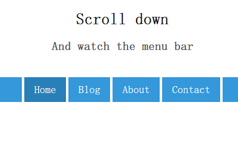
之前已为大家介绍了好多css3实现的导航菜单。今天分享一款基于jquery滑动后固定于顶部的导航。这款导航的特点是初始位于顶部下面一百个像素,当鼠标滚动时到下方,导航一直处于顶部。效果图如下:
实现的代码。
html代码:
<h1>
        Scroll down</h1>
    <h2>
        And watch the menu bar</h2>
    <nav id="menu">
        <h1 id="sitename">
            MySite</h1>
        <ul>
            <li class="active"><a href="http://www.w2bc.com">Home</a></li>
            <li><a href="http://www.w2bc.com">Blog</a></li>
            <li><a href="http://www.w2bc.com">About</a></li>
            <li><a href="http://www.w2bc.com">Contact</a></li>
        </ul>
    </nav>
css代码:
  body
        {
            height: 2000px;
            font-family: Roboto, sans-serif;
            -webkit-font-smoothing: antialiased;
        }

        h1, h2
        {
            text-align: center;
        }

        h1
        {
            color: #222;
        }

        h2
        {
            color: #555;
        }

        nav#menu
        {
            margin-top: 50px;
            background: #3498db;
            text-align: center;
            height: 50px;
            width: 100%;
        }

        nav#menu ul
        {
            padding: 0;
            background: white;
            margin: 0 auto;
            display: inline-block;
            height: 50px;
        }

        nav#menu ul li
        {
            float: left;
            padding: 0 20px;
            background: #3498db;
            list-style: none;
            margin-right: 5px;
            line-height: 50px;
            height: 50px; /*
   * This element will get an alternative style
   * once we apply the "scrolled" class.
   * We also want a nice animation so we can
   * simply set CSS3 transitions for this.
   */
            transition: margin 0.1s ease-in-out;
        }

        nav#menu ul li:nth-child(1)
        {
            margin-left: 5px;
        }

        nav#menu ul li.active
        {
            background: #2980b9;
        }

        nav#menu ul li a
        {
            color: white;
            text-decoration: none;
            font-size: 1.3em;
        }

        nav#menu h1#sitename
        {
            font-size: 1.2em;
            line-height: 50px;
            margin: 0;
            position: absolute;
            left: 0.5em;
            color: white;
            opacity: 0; /*
   * Same thing here as with the menu items.
   * This element will be animated into its
   * alt. state with the transition property
   */
            transition: opacity 0.1s ease-in-out;
        }


        /*********************************************
 * Once the 'scrolled' class is toggled
 * we can set any alternative styling that we
 * want for the menu bar
 *********************************************/

        nav#menu.scrolled
        {
            margin: 0;
            position: fixed;
            top: 0;
        }

        nav#menu.scrolled ul li
        {
            margin: 0;
        }

        nav#menu.scrolled h1#sitename
        {
            opacity: 1;
        }
js代码:
        var menu = $('nav#menu');

        var watcher = scrollMonitor.create(menu);

        watcher.lock();

        watcher.stateChange(function () {
            $(menu).toggleClass('scrolled', this.isAboveViewport)
        }); //@ sourceURL=pen.js
注:本文爱编程原创文章,转载请注明原文地址:http://www.w2bc.com/Article/7501


版权所有 爱编程 © Copyright 2012. All Rights Reserved.
闽ICP备12017094号-3
闽ICP备12017094号-3