纯css3实现的360度翻转按钮
阅读:8192
时间:2018-02-01 03:25
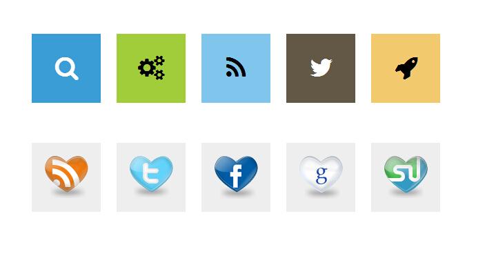
今天要给大家分享的是由css3实现的翻转360动画按钮。之前已为大家分享了好几款css3按钮,大家可以点击链接进去找一找适合自己的。哈哈。下面先为大家上效果图:
不错吧,下面是实现的代码。
html代码:
        <ul class="flatflipbuttons">
            <li><a href="http://www.w2bc.com" title="Search"><span class="icon-search"></span>
            </a><b>Search</b></li>
            <li><a href="http://www.w2bc.com"><span class="icon-gears"></span></a><b>Gears</b></li>
            <li><a href="http://www.w2bc.com"><span class="icon-rss"></span></a><b>RSS</b></li>
            <li><a href="http://www.w2bc.com"><span class="icon-twitter"></span></a><b>Twitter</b></li>
            <li><a href="http://www.w2bc.com"><span class="icon-rocket"></span></a><b>Rocket</b></li>
        </ul>
        <br />
        <br />
        <ul class="flatflipbuttons second">
            <li><a href="http://www.w2bc.com"><span>
                <img src="imgs/rss-heart.png" /></span></a></li>
            <li><a href="http://www.w2bc.com"><span>
                <img src="imgs/twitter-heart.png" /></span></a></li>
            <li><a href="http://www.w2bc.com"><span>
                <img src="imgs/facebook-heart.png" /></span></a></li>
            <li><a href="http://www.w2bc.com"><span>
                <img src="imgs/google-heart.png" /></span></a></li>
            <li><a href="http://www.w2bc.com"><span>
                <img src="imgs/stumble-heart.png" /></span></a></li>
        </ul>
css代码:
        ul.flatflipbuttons
        {
            margin: 0;
            padding: 0;
            list-style: none;
            -webkit-perspective: 10000px; /* larger the value, the less pronounced the 3D effect */
            -moz-perspective: 10000px;
            perspective: 10000px;
        }

        ul.flatflipbuttons li
        {
            margin: 0;
            display: inline-block;
            width: 100px; /* dimensions of buttons. */
            height: 100px;
            margin-right: 15px; /* spacing between buttons */
            background: white;
            text-transform: uppercase;
            text-align: center;
        }

        ul.flatflipbuttons li a
        {
            display: table;
            font: bold 36px Arial; /* font size, pertains to icon fonts specifically */
            width: 100%;
            height: 100%;
            margin-bottom: 4px;
            color: black;
            background: #3B9DD5;
            text-decoration: none;
            outline: none;
            -webkit-transition: all 300ms ease-out; /* CSS3 transition. Last value is pause before transition play */
            -moz-transition: all 300ms ease-out;
            transition: all 300ms ease-out;
        }

        ul.flatflipbuttons li:nth-of-type(1) a
        {
            color: white;
            background: #3B9DD5;
        }

        ul.flatflipbuttons li:nth-of-type(2) a
        {
            background: #A1CD3A;
        }

        ul.flatflipbuttons li:nth-of-type(3) a
        {
            background: #80C5EC;
        }

        ul.flatflipbuttons li:nth-of-type(4) a
        {
            color: white;
            background: #635746;
        }

        ul.flatflipbuttons li:nth-of-type(5) a
        {
            background: #F2C96D;
        }

        ul.flatflipbuttons li a span
        {
            -moz-box-sizing: border-box;
            -webkit-box-sizing: border-box;
            box-sizing: border-box;
            display: table-cell;
            vertical-align: middle;
            width: 100%;
            height: 100%;
            -webkit-transition: all 300ms ease-out; /* CSS3 transition. */
            -moz-transition: all 300ms ease-out;
            transition: all 300ms ease-out;
        }

        ul.flatflipbuttons li b
        {
            /* CSS for text beneath button */
            display: block;
            position: relative;
            width: 100%;
            opacity: 0;
            -webkit-transition: all 300ms ease-out 0.2s; /* CSS3 transition. 0.2s delay */
            -moz-transition: all 300ms ease-out 0.2s;
            transition: all 300ms ease-out 0.2s;
        }


        ul.flatflipbuttons li a img
        {
            /* CSS for image if defined inside button */
            border-width: 0;
            vertical-align: middle;
        }


        ul.flatflipbuttons li:hover a
        {
            -webkit-transform: rotateY(180deg); /* flip horizontally 180deg*/
            -moz-transform: rotateY(180deg);
            transform: rotateY(180deg);
            background: #c1e4ec; /* bgcolor of button onMouseover*/
            -webkit-transition-delay: 0.2s;
            -moz-transition-delay: 0.2s;
            transition-delay: 0.2s;
        }

        ul.flatflipbuttons li:hover a span
        {
            color: black; /* color of icon font onMouseover */
            -webkit-transform: rotateY(180deg);
            -moz-transform: rotateY(180deg); /* flip horizontally 180deg*/
            transform: rotateY(180deg);
            -webkit-transition-delay: 0.2s;
            -moz-transition-delay: 0.2s;
            transition-delay: 0.2s;
        }


        ul.flatflipbuttons li:hover b
        {
            opacity: 1;
        }

        /* CSS for 2nd menu below specifically */

        ul.second li a
        {
            background: #eee !important;
        }

        ul.second li a:hover
        {
            background: #ddd !important;
        }
注:本文爱编程原创文章,转载请注明原文地址:http://www.w2bc.com/Article/4762


版权所有 爱编程 © Copyright 2012. All Rights Reserved.
闽ICP备12017094号-3
闽ICP备12017094号-3