一款基于css3的列表toggle特效
阅读:2906
时间:2018-02-01 03:26
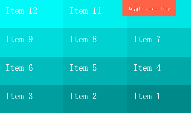
今天给大家带来一款基于css3的列表toggle特效。右上角一个按钮,当列表不显示的时候,单击按钮列表动画出现,当列表显示时,单击按钮,列表动画消失,效果图如下:
实现的代码。
htm代码
 <div class='menu'>
        toggle visibility</div>
    <ul class='list reverse'>
        <li class='item'>Item 1</li>
        <li class='item'>Item 2</li>
        <li class='item'>Item 3</li>
        <li class='item'>Item 4</li>
        <li class='item'>Item 5</li>
        <li class='item'>Item 6</li>
        <li class='item'>Item 7</li>
        <li class='item'>Item 8</li>
        <li class='item'>Item 9</li>
        <li class='item'>Item 10</li>
        <li class='item'>Item 11</li>
        <li class='item'>Item 12</li>
    </ul>
css3代码:
* {
  -moz-box-sizing: border-box;
       box-sizing: border-box;
}

body {
  margin: 0;
  padding: 0;
  font-family: 'Avenir Next';
  background: #000;
  color: white;
}

.menu {
  background: tomato;
  padding: 20px;
  position: absolute;
  z-index: 1;
  height: 55px;
  top: 0;
  right: 50px;
}

.list {
  -webkit-perspective: 100vw;
          perspective: 100vw;
  width: 100vw;
  height: 100vh;
  display: -webkit-flex;
  display: -ms-flexbox;
  display: flex;
  -webkit-flex-flow: column wrap;
      -ms-flex-flow: column wrap;
          flex-flow: column wrap;
}
.list.hidden {
  pointer-events: none;
}
.list.hidden .item {
  -webkit-animation: disappear both;
          animation: disappear both;
  -webkit-animation-direction: alternate;
          animation-direction: alternate;
}
.list.reverse {
  -webkit-flex-flow: row-reverse wrap-reverse;
      -ms-flex-flow: row-reverse wrap-reverse;
          flex-flow: row-reverse wrap-reverse;
}

.item {
  font-size: 30px;
  padding: 20px;
  height: 100px;
  width: calc(100vw / 3);
  height: calc(100vh / 4);
  -webkit-animation: appear both;
          animation: appear both;
}

.item:nth-child(1) {
  background: #008a8a;
  -webkit-animation-delay: 0.03333s !important;
  -webkit-animation-duration: 0.1s !important;
}

.item:nth-child(2) {
  background: #009494;
  -webkit-animation-delay: 0.06667s !important;
  -webkit-animation-duration: 0.2s !important;
}

.item:nth-child(3) {
  background: #009f9f;
  -webkit-animation-delay: 0.1s !important;
  -webkit-animation-duration: 0.3s !important;
}

.item:nth-child(4) {
  background: #00a9a9;
  -webkit-animation-delay: 0.13333s !important;
  -webkit-animation-duration: 0.4s !important;
}

.item:nth-child(5) {
  background: #00b3b3;
  -webkit-animation-delay: 0.16667s !important;
  -webkit-animation-duration: 0.5s !important;
}

.item:nth-child(6) {
  background: #00bdbd;
  -webkit-animation-delay: 0.2s !important;
  -webkit-animation-duration: 0.6s !important;
}

.item:nth-child(7) {
  background: #00c7c7;
  -webkit-animation-delay: 0.23333s !important;
  -webkit-animation-duration: 0.7s !important;
}

.item:nth-child(8) {
  background: #00d2d2;
  -webkit-animation-delay: 0.26667s !important;
  -webkit-animation-duration: 0.8s !important;
}

.item:nth-child(9) {
  background: #00dcdc;
  -webkit-animation-delay: 0.3s !important;
  -webkit-animation-duration: 0.9s !important;
}

.item:nth-child(10) {
  background: #00e6e6;
  -webkit-animation-delay: 0.33333s !important;
  -webkit-animation-duration: 1s !important;
}

.item:nth-child(11) {
  background: #00f0f0;
  -webkit-animation-delay: 0.36667s !important;
  -webkit-animation-duration: 1.1s !important;
}

.item:nth-child(12) {
  background: #00fafa;
  -webkit-animation-delay: 0.4s !important;
  -webkit-animation-duration: 1.2s !important;
}

@-webkit-keyframes appear {
  from {
    opacity: 0;
    -webkit-transform: scale(0.8);
            transform: scale(0.8);
  }
  to {
    opacity: 1;
    -webkit-transform: scale(1);
            transform: scale(1);
  }
}

@keyframes appear {
  from {
    opacity: 0;
    -webkit-transform: scale(0.8);
            transform: scale(0.8);
  }
  to {
    opacity: 1;
    -webkit-transform: scale(1);
            transform: scale(1);
  }
}
@-webkit-keyframes disappear {
  from {
    opacity: 1;
    -webkit-transform: scale(1);
            transform: scale(1);
  }
  to {
    opacity: 0;
    -webkit-transform: scale(0.9) rotateX(0deg) translateZ(-1500px);
            transform: scale(0.9) rotateX(0deg) translateZ(-1500px);
  }
}
@keyframes disappear {
  from {
    opacity: 1;
    -webkit-transform: scale(1);
            transform: scale(1);
  }
  to {
    opacity: 0;
    -webkit-transform: scale(0.9) rotateX(0deg) translateZ(-1500px);
            transform: scale(0.9) rotateX(0deg) translateZ(-1500px);
  }
}
via:http://www.w2bc.com/Article/14154


版权所有 爱编程 © Copyright 2012. All Rights Reserved.
闽ICP备12017094号-3
闽ICP备12017094号-3