一款基于jquery的喜欢动画按钮
阅读:1981
时间:2018-02-01 03:26
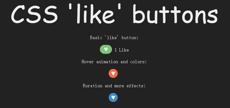
今天给大家带来一款基于jquery的喜欢动画按钮。这个实例中给了三种动画特效。效果图如下:
实现的代码。
html代码:
 <p class='heading'>
        CSS 'like' buttons
    </p>
    <p>
        Basic 'like' button:</p>
    <div class='like'>
        <button class='like-toggle basic'>
            ?</button>
        <span class='hidden'>1 Like</span>
    </div>
    <p>
        Hover animation and colors:</p>
    <div class='like'>
        <button class='like-toggle basic2'>
            ?</button>
        <span class='hidden'>I like this</span>
    </div>
    <p>
        Roration and more effects:</p>
    <div class='like'>
        <button class='like-toggle basic3'>
            ?</button>
        <span class='hidden'>10 Likes</span>
    </div>
    <script src='jquery.js'></script>
    <script>
        $(function () {
            $('.like-toggle').click(function () {
                $(this).toggleClass('like-active');
                $(this).next().toggleClass('hidden');
            });
        });
        //@ sourceURL=pen.js
    </script>
css代码:
  *
        {
            transition: all 0.3s linear;
        }

        body
        {
            background: #222;
            color: #eee;
            text-align: center;
        }

        .hidden
        {
            font-size: 0;
        }

        .heading
        {
            font-family: 'Amatic SC' , cursive;
            font-size: 5em;
            margin: 0;
        }

        .like, p
        {
            font-family: 'Open Sans';
        }

        .like-toggle
        {
            outline: none;
            box-shadow: none;
            border: none;
            width: 40px;
            height: 30px;
            font-size: 1.3em;
            border-radius: 100px;
        }

        .like-active.basic
        {
            background: #7CC576;
            color: white;
        }

        .like-toggle.basic2
        {
            border: none;
            width: 30px;
            height: 30px;
            font-size: 1.3em;
            border-radius: 100px;
            background: #F26C4F;
            color: #fff;
        }

        .like-active.basic2
        {
            background: #F06EA9;
        }

        .like-toggle.basic2:not(.like-active):hover
        {
            background: #438CCA;
            width: 60px;
        }

        .like-toggle.basic3
        {
            border: none;
            width: 30px;
            height: 30px;
            font-size: 1.3em;
            border-radius: 100px;
            background: #438CCA;
            color: #fff;
            margin-bottom: 10px;
        }

        .like-active.basic3
        {
            background: #7CC576;
            transform: rotate(-360deg);
        }

        .like-toggle.basic3:not(.like-active):hover
        {
            background: #F26C4F;
            transform: rotate(90deg);
        }
via:http://www.w2bc.com/Article/12911


版权所有 爱编程 © Copyright 2012. All Rights Reserved.
闽ICP备12017094号-3
闽ICP备12017094号-3